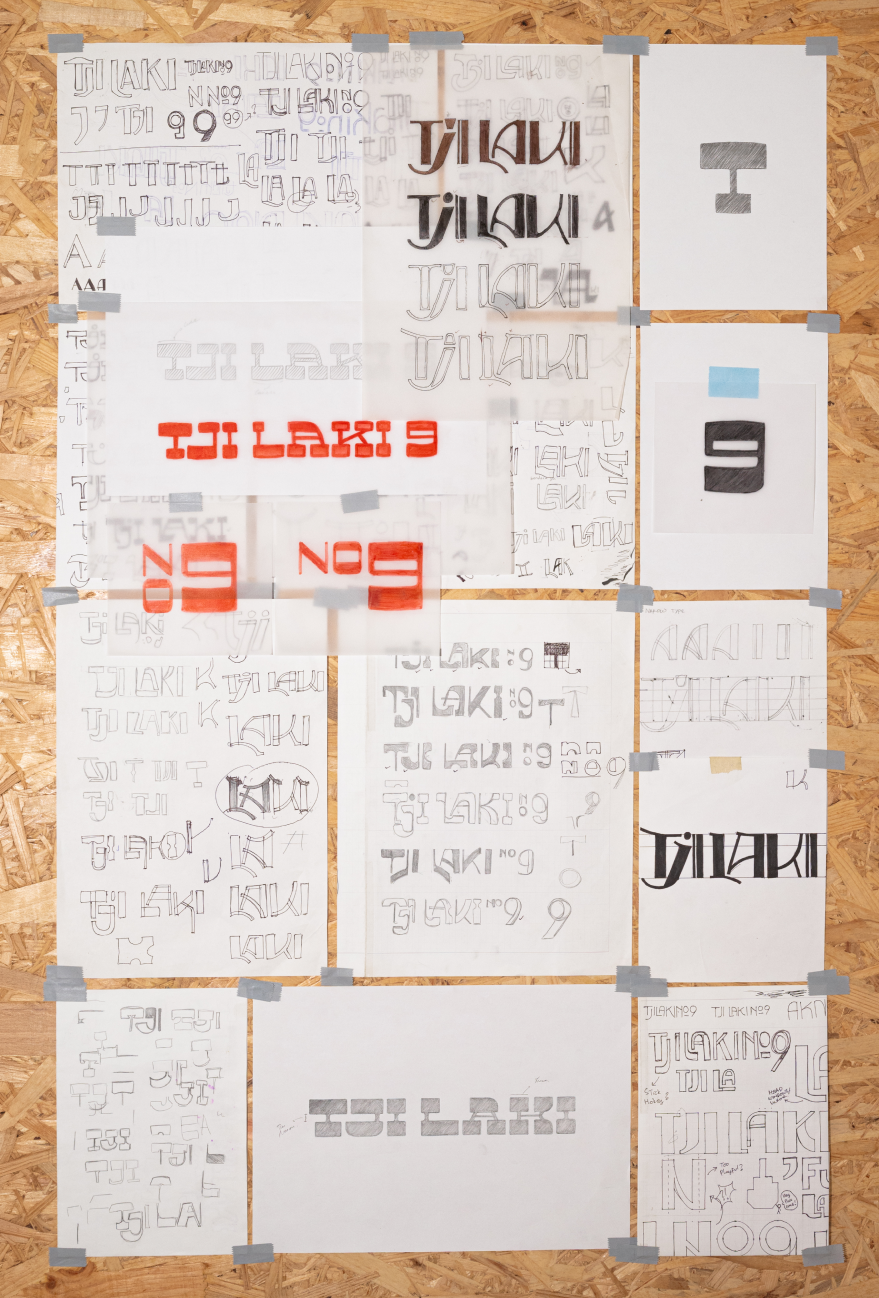
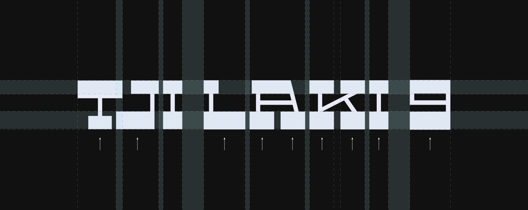
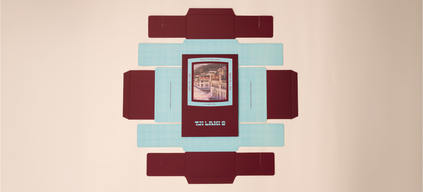
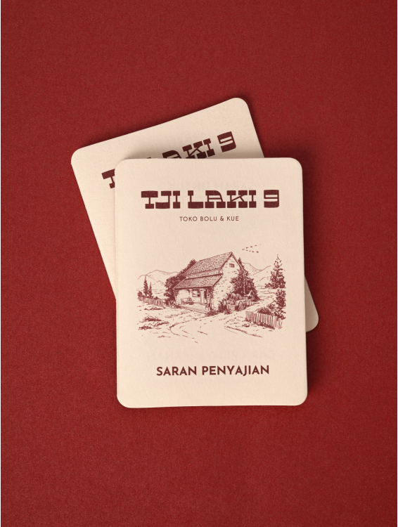
The visual language began with the logotype, shaped through manual sketch
exploration inspired by Art Deco typographic styles of the era. Rather than
creating a rigid geometric form, the lettering was softened and allowed to
“expand,” subtly referencing the rising form of banana cake (bolu
pisang)—the brand’s core product.
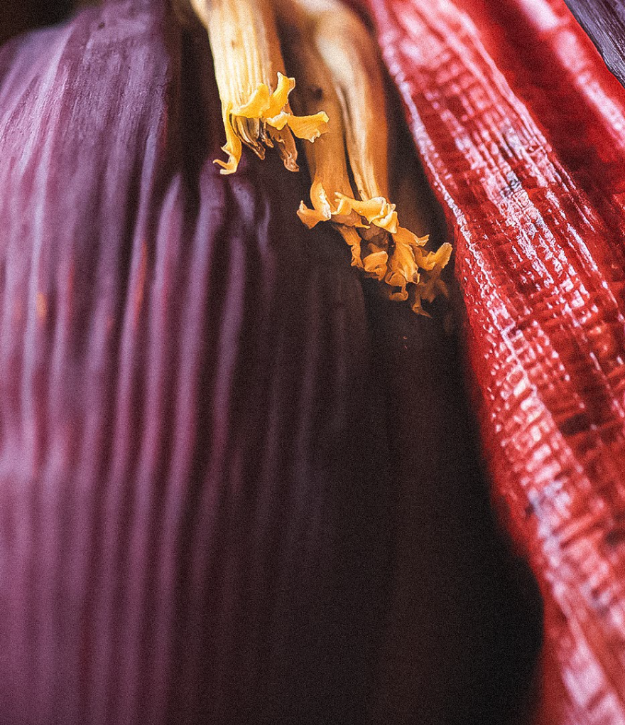
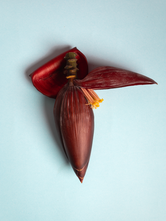
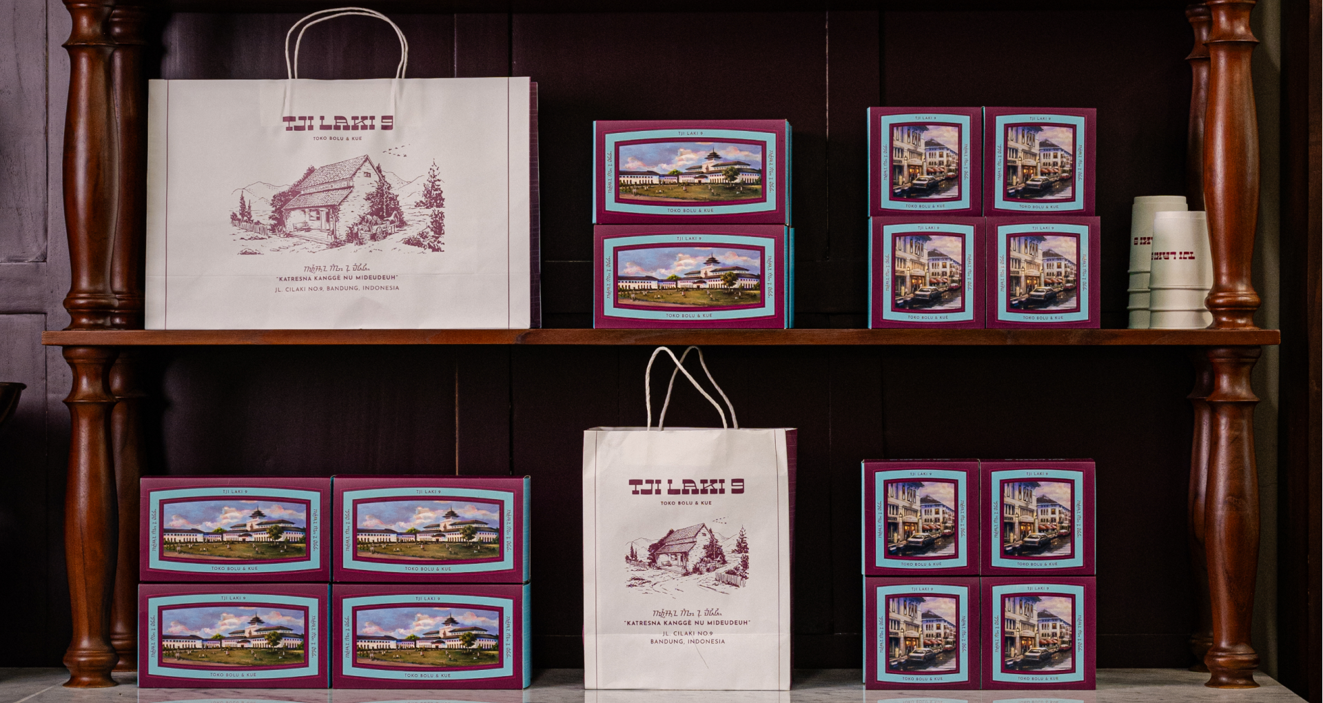
Color became a crucial decision in positioning the brand. Instead of
adopting literal banana tones, the palette was derived from a broader
observation of the banana plant itself. The deep maroon of the banana
blossom is paired with soft light blue that inspired from the original
artefact that we found there —creating a balance that feels humble,
distinctive, and quietly confident.
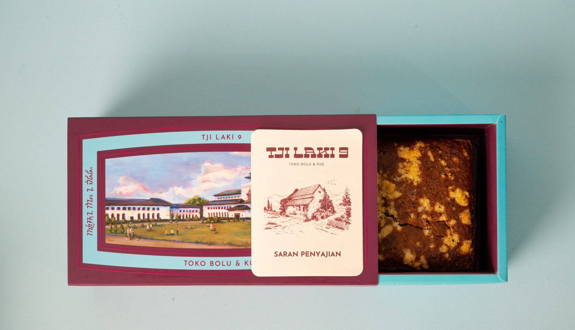
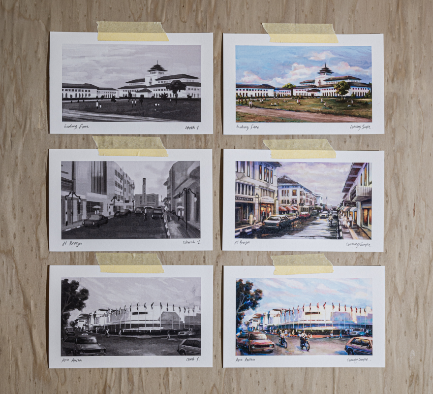
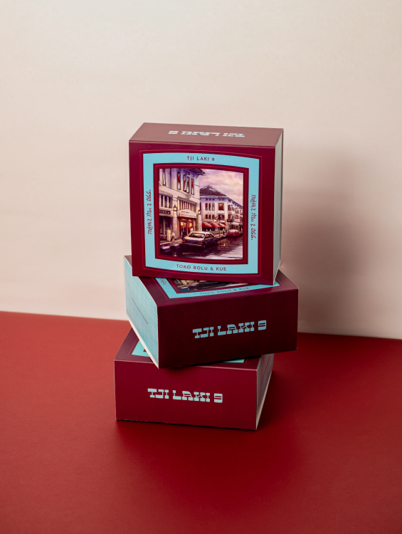
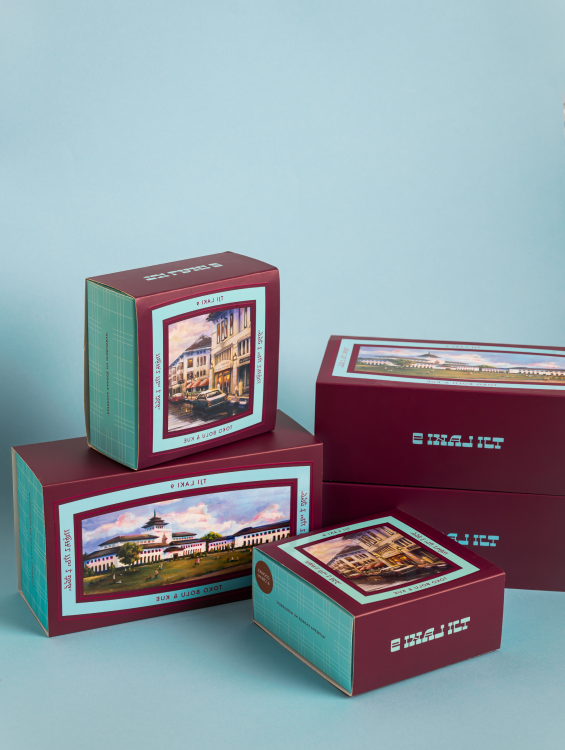
To deepen the romantic narrative of Bandung, a custom illustration was
developed—depicting a nostalgic vision of the city in the 19th century. The
illustration is framed within a container shape that echoes the expanding
curves of the logotype, maintaining visual harmony across applications.
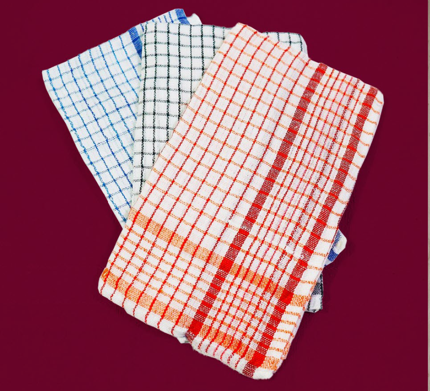
Local textile motifs traditionally used in everyday life were also incorporated into the packaging system. These elements ground the brand in familiarity and cultural authenticity, reinforcing the idea that oleh-oleh is both intimate and rooted in daily tradition.
Local textile motifs traditionally used in everyday life were also incorporated into the packaging system. These elements ground the brand in familiarity and cultural authenticity, reinforcing the idea that oleh-oleh is both intimate and rooted in daily tradition.
Icons and graphic elements were developed with the same sensitivity. Each
symbol draws from cultural references
found across West Java, functioning not as decoration, but as quiet carriers of layered meaning within the system.
found across West Java, functioning not as decoration, but as quiet carriers of layered meaning within the system.
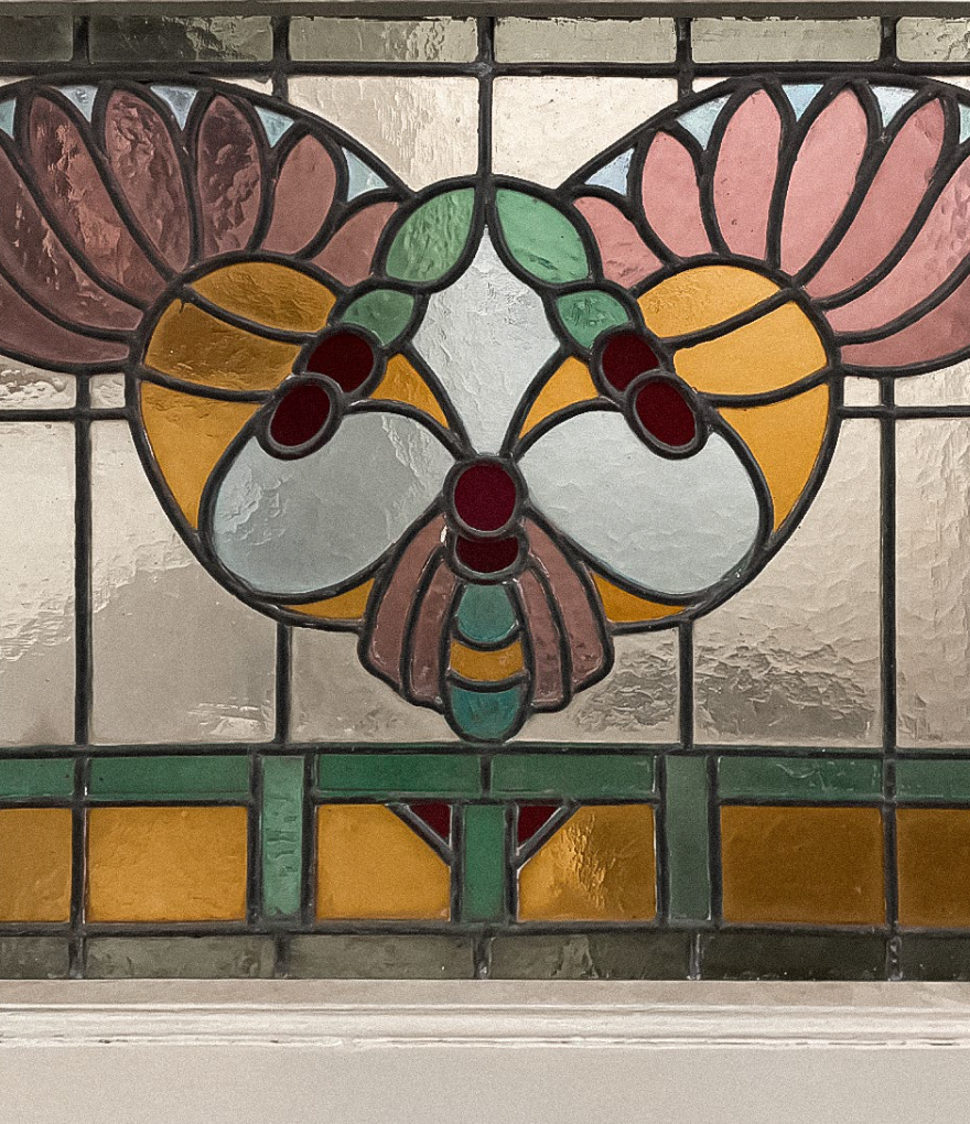
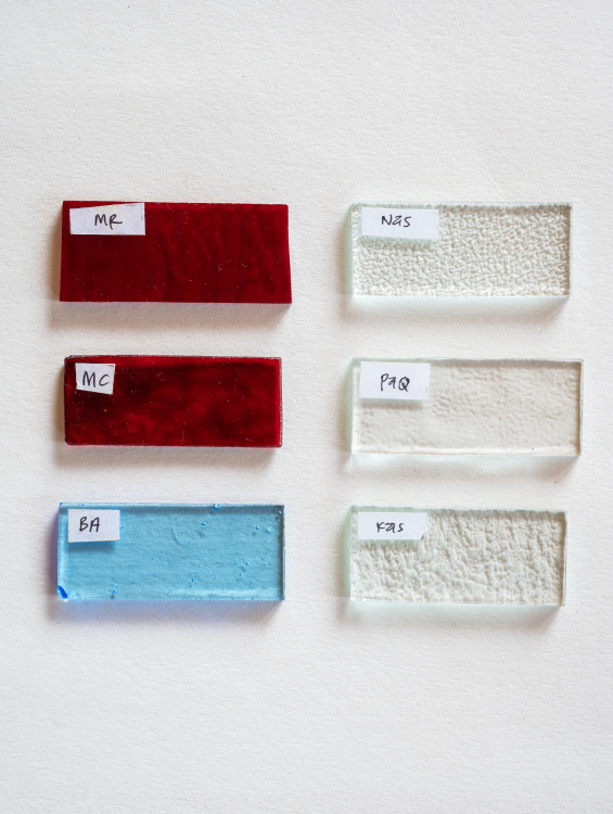
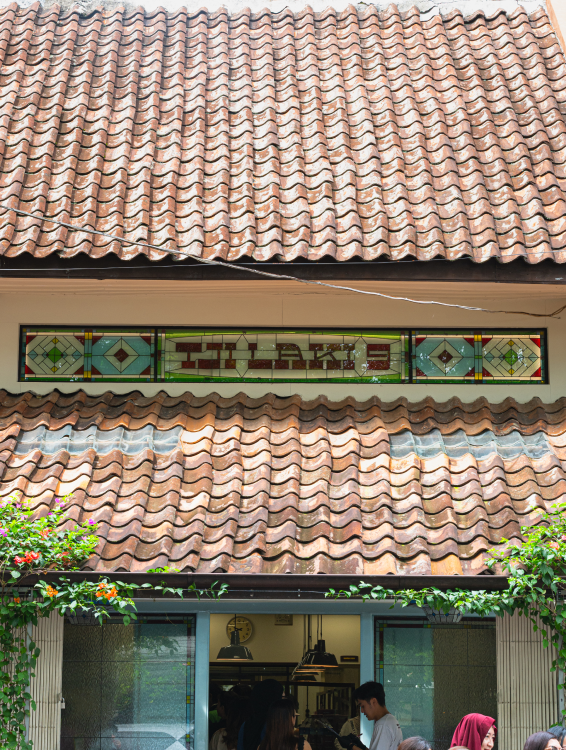
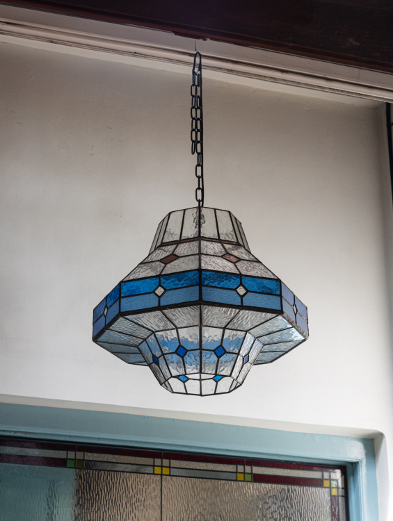
During research within the heritage house, stained glass artifacts were
discovered—an architectural detail that ultimately became integral to the
store’s identity. The stained glass language extends from signage to
decorative lighting, embedding the spirit of the building into the brand
itself. This integration transforms the space into more than a store; it
becomes an environment where craftsmanship, architecture, and storytelling
coexist.
IDENTITY BRANDING
FOR TJI LAKI 9
SEREAL | 2023
CREATIVE DIRECTOR Nicky borneo | ART DIRECTOR iqbal fadilah | LEAD DESIGNER faris naufal | COPYWRITER adriana winda | DESIGNER nurul pratiwi, shidqi qolbi
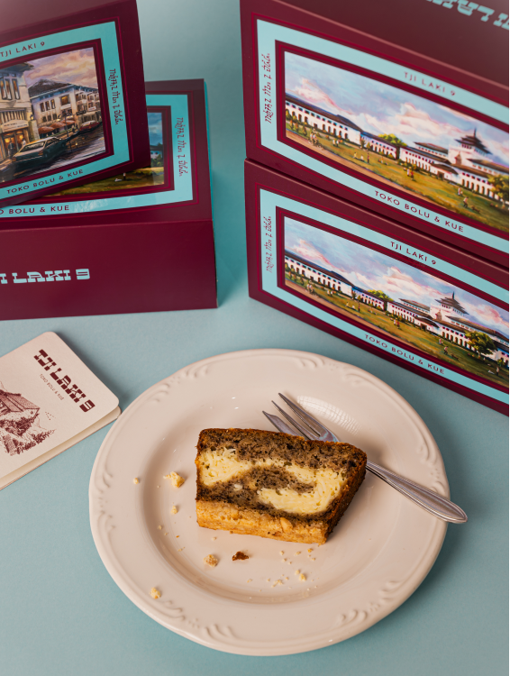
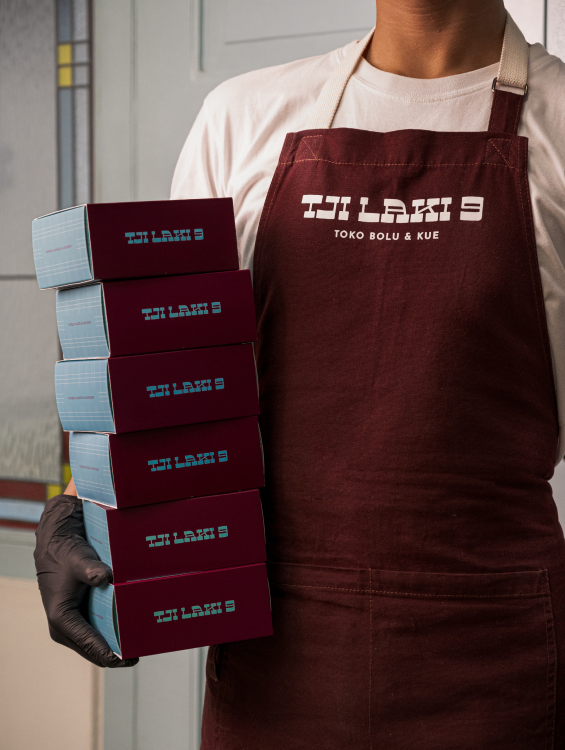
Tjilaki 9 is a souvenir store in Bandung that celebrates the tradition
of giving oleh-oleh. More than redefining what an oleh-oleh can be,
Tjilaki 9 sets a new standard within Bandung’s souvenir culture by
adding meaning, craftsmanship, and emotional value to the experience.
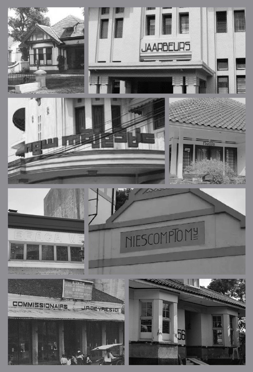
Located inside a preserved heritage house, the space immediately evokes memories of old Bandung. This connection led to a deeper exploration of the city’s architectural history, particularly the arrival of Art Deco in the 1920s a defining moment in Bandung’s visual identity.
Located inside a preserved heritage house, the space immediately evokes memories of old Bandung. This connection led to a deeper exploration of the city’s architectural history, particularly the arrival of Art Deco in the 1920s a defining moment in Bandung’s visual identity.
The traditions, the shared moments after being far away from family and
friends—this is the heart of Tji Laki 9.
Home-made warmth. Craftsmanship. Premium ingredients. A preserved house filled with memory.
Home-made warmth. Craftsmanship. Premium ingredients. A preserved house filled with memory.
OTHER WORKS NURUL PRATIWI
(2025)
(2024)
(2025)
EMAIL
INSTAGRAM
©2026