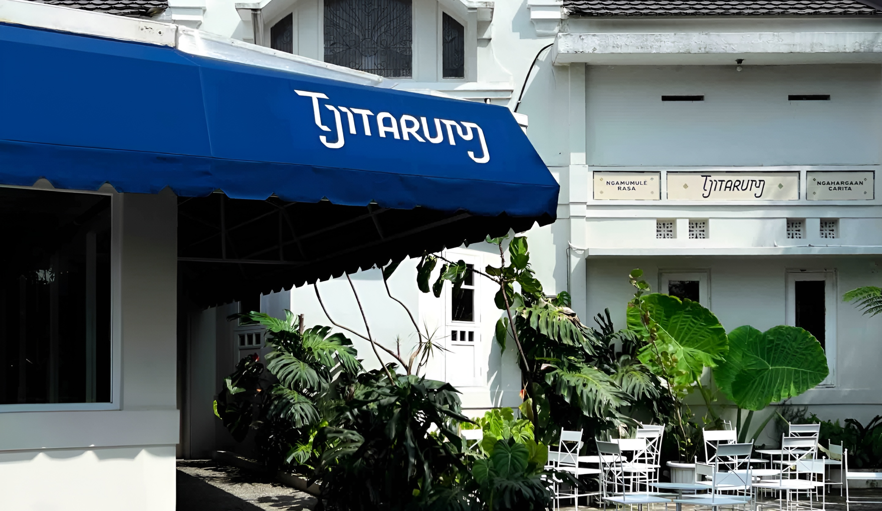
Guided by the phrase “ngamumule rasa, ngahargaan carita”—preserving flavors
while honoring stories—This foundation informed the brand’s core identity,
beginning with the logotype. Its subtle slant originates from research into
Sundanese script, historically written on palm leaves. The horizontal fibers
of the leaf naturally guided the direction of writing, where vertical
strokes risked damaging the surface.
The design process moved from studying palm-leaf writing mechanics, to experimenting with calligraphic gestures, and finally to translating those principles into Roman letterforms, allowing historical logic to shape a contemporary form.
The design process moved from studying palm-leaf writing mechanics, to experimenting with calligraphic gestures, and finally to translating those principles into Roman letterforms, allowing historical logic to shape a contemporary form.
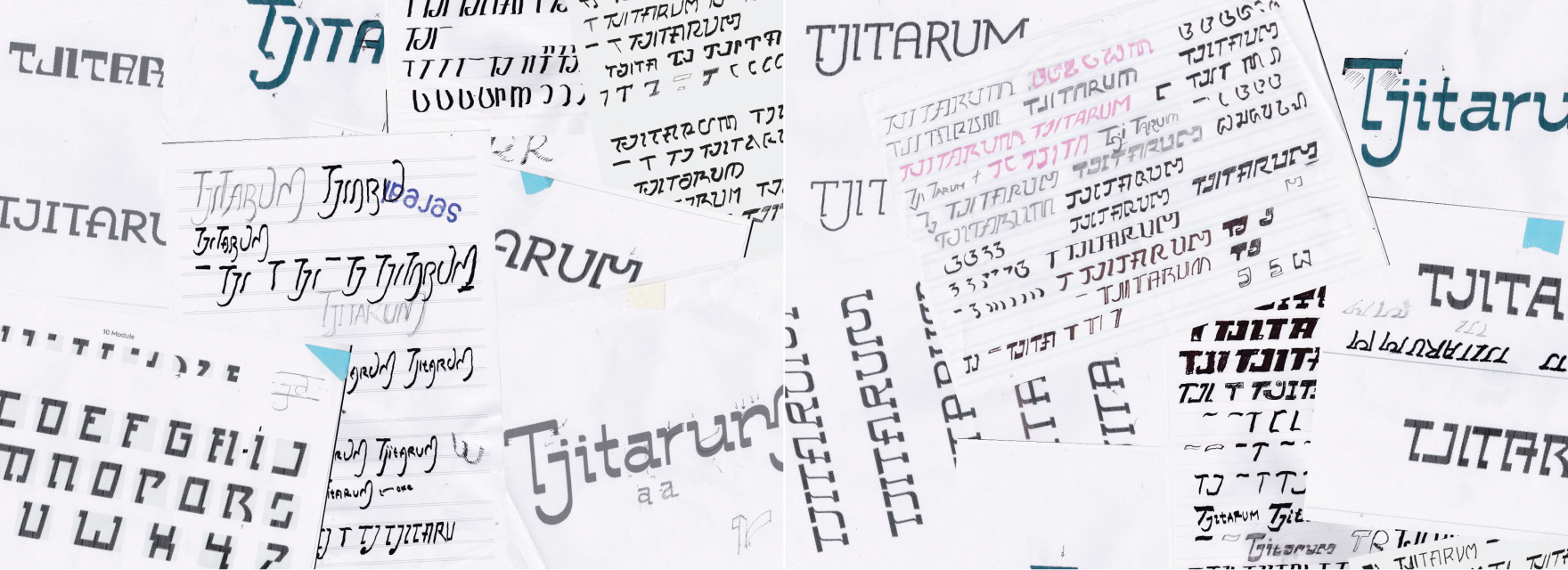
The result is a logotype that feels grounded and forward-moving,
carrying its reference without needing to announce it.
carrying its reference without needing to announce it.

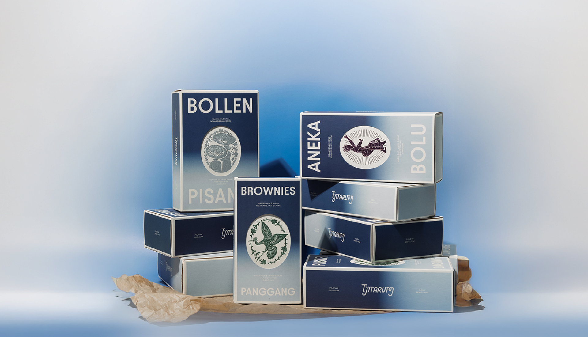
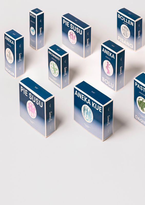
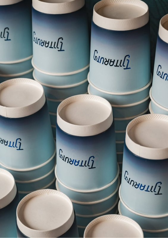
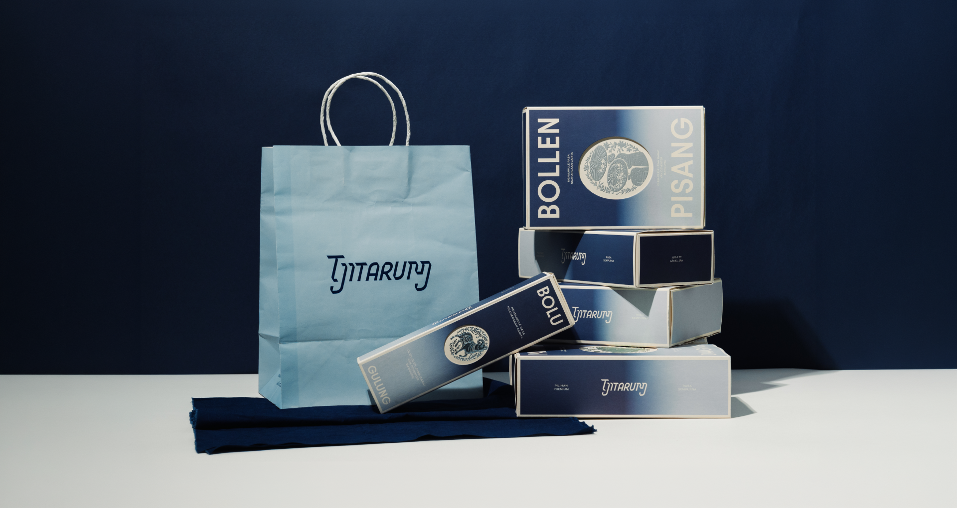
From there, tarum takes on a more visible role within the brand’s visual
system. Indigo naturally shifting tones, and this quality informs the use of
gradients across packaging and applications. Rather than settling into a
single hue, the color language remains fluid mirroring the living nature of
natural dye and the river it originates from.


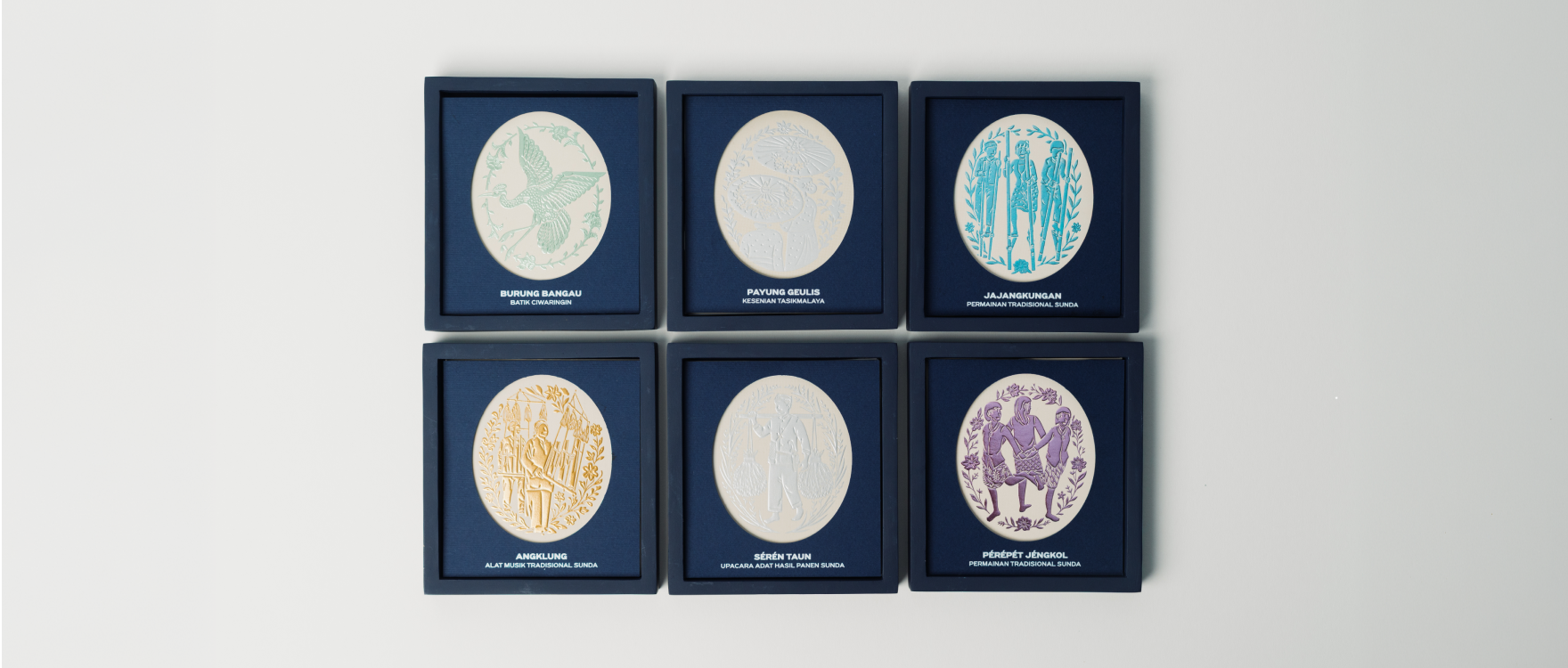
Icons and graphic elements were developed with the same sensitivity. Each
symbol draws from cultural references
found across West Java, functioning not as decoration, but as quiet carriers of layered meaning within the system.
found across West Java, functioning not as decoration, but as quiet carriers of layered meaning within the system.
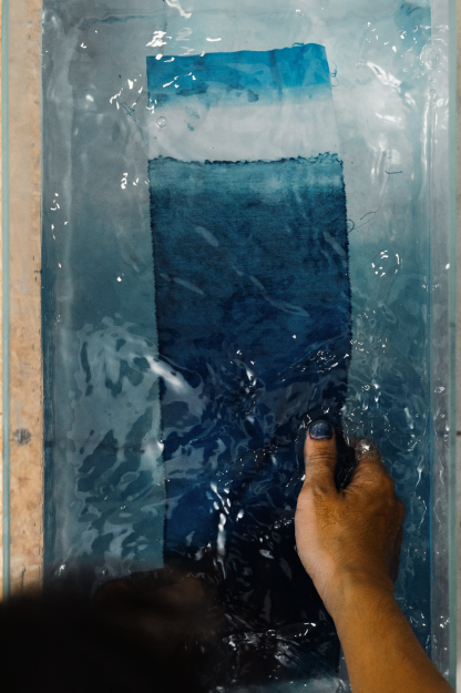
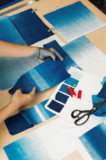
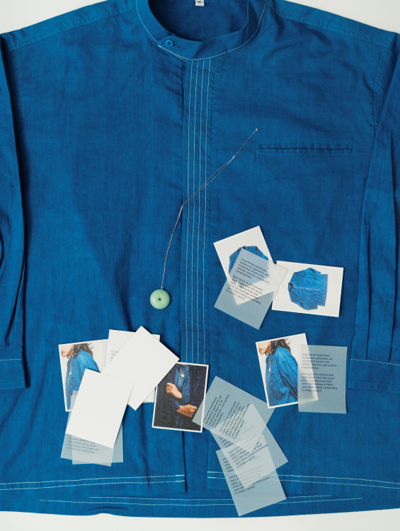
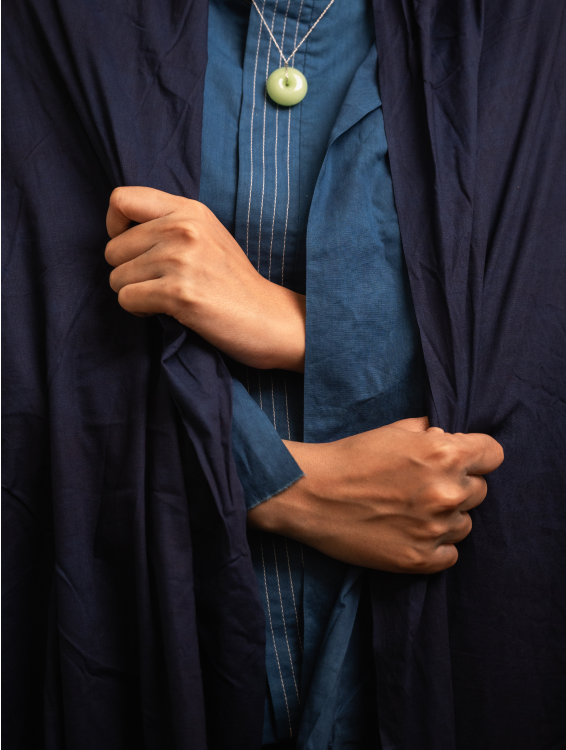
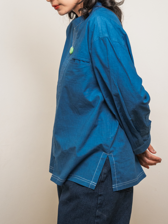
The influence of tarum then extends beyond graphics into material
exploration. Dyed textiles become both surface and substance, bridging
traditional techniques with modern application. The uniform design draws
from traditional Sundanese attire, specifically pangsi, a garment associated
with humility, resilience, and upright character. Its silhouette,
construction, and stitching echo these values subtly—allowing tradition to
be felt rather than stated.
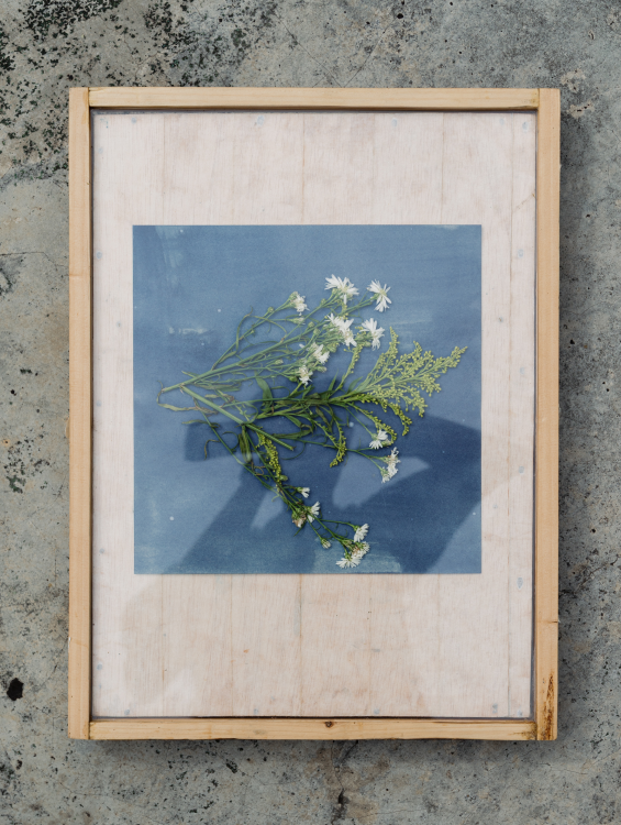
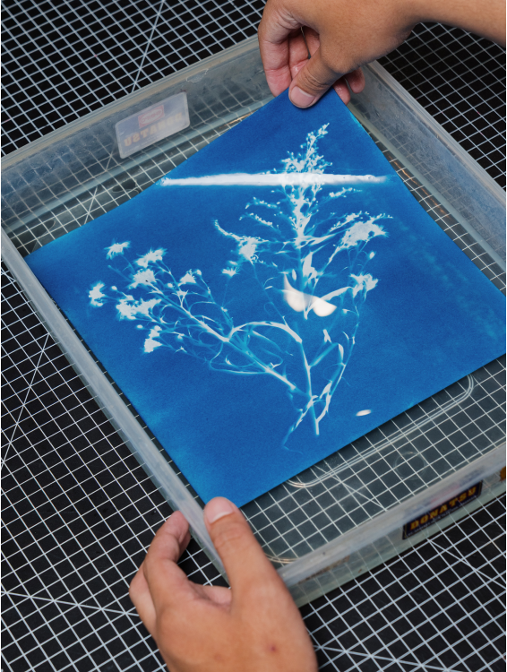
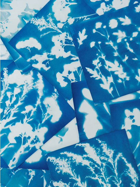
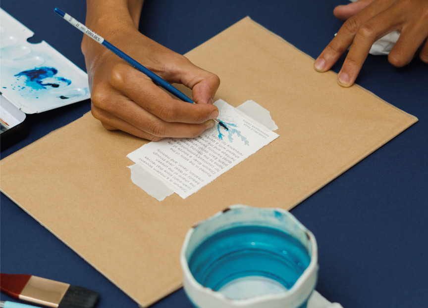
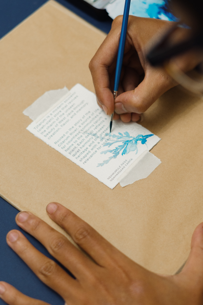
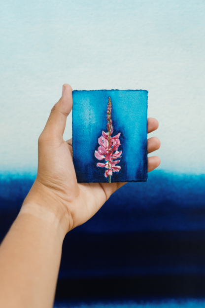
Extending the dyeing process, manual techniques such as cyanotype and
watercolor introduce soft gradients and textures. These visuals echo the
Citarum River, always flowing, never static, reinforcing a sense of
continuity throughout the brand.
IDENTITY BRANDING
FOR TJITARUM
SEREAL | 2025
CREATIVE DIRECTOR Nicky borneo | ART DIRECTOR iqbal fadilah | LEAD DESIGNER nurul pratiwi | COPYWRITER debora violin | DESIGNER FIRMAN NAUFAL, DEWA RANGGA, daniel iota
Tjitarum is a contemporary souvenir bakery and café based in Bandung,
West Java. More than a place to buy treats, it’s a space where culture
quietly lives, where heritage takes shape as things you can see, taste,
and bring home.
Named after the Citarum River, one of West Java’s most vital natural and cultural arteries, Tjitarum draws its souls from tarum (indigo). Long before it became a color, tarum shaped Sundanese life through textiles, trade, and everyday rituals. Reimagined as a modern oleh-oleh store, Tjitarum reveals the unseen beauty of West Java through flavor, craft, and memory.
Named after the Citarum River, one of West Java’s most vital natural and cultural arteries, Tjitarum draws its souls from tarum (indigo). Long before it became a color, tarum shaped Sundanese life through textiles, trade, and everyday rituals. Reimagined as a modern oleh-oleh store, Tjitarum reveals the unseen beauty of West Java through flavor, craft, and memory.
Traditional flavors are refined through a contemporary lens, cultural
stories are preserved through modern forms,
and the past is not frozen—but allowed to live, adapt, and resonate in the present.
and the past is not frozen—but allowed to live, adapt, and resonate in the present.
OTHER WORKS NURUL PRATIWI
(2025)
(2024)
(2025)
EMAIL
INSTAGRAM
©2026